It's been a quite sometime now since I last made a blog... Blame it to my computer who is ...well... a little younger than me... haha
Anyways, let us all forget about this age... it's just a digit as Me says haha...
Since this is the last month of the year 2013, I would like to share with you guys, what I just found out... Something men and women would surely be interested with...
Each and everyone of us has this problem ( sometimes ) especially when we are going out for a meeting, dates or even with just going out with friends.. Just like me, I don't want to be laughed at.. or stared by anyone with a criticizing smile... We all wanted to be someone to be looked at with praising eyes...
Let's talk about colors...
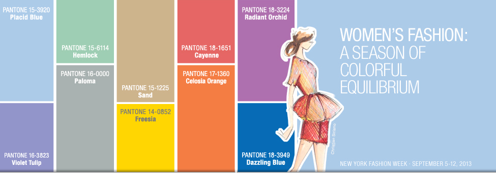
Source : http://www.pantone.com/pages/fcr/default.aspx?season=spring&year=2014&pid=3
Okay okay.. I know the text is too small to read...
Start with...from upper left to right...
Pantone 15-3920 Placid Blue
Pantone 15-6114 Hemlock
Pantone 15-1225 Sand
Pantone 18-1651 Cayenne
Pantone 18-3224 Radiant Orchid
As you notice... the shades are all light... for me... beautiful shades to start the coming new year ...
Now, from lower left to right...
Pantone 16-3823 Violet Tulip
Pantone 16-0000 Paloma
Pantone 14-0852 Freesia
Pantone 17-1360 Celosia Orange
Pantone 18-3949 Dazzling Blue
Compared to the first 5 shades above.. a little darker but still cool to the eyes ...
We could even pair it with the above shades.. like.. the Radiant Orchid with the Dazzling Blue ... Something different and a head turner...
Oh, by the way, those are from the Pantone Women's section . Now let us continue browsing the Men's section...
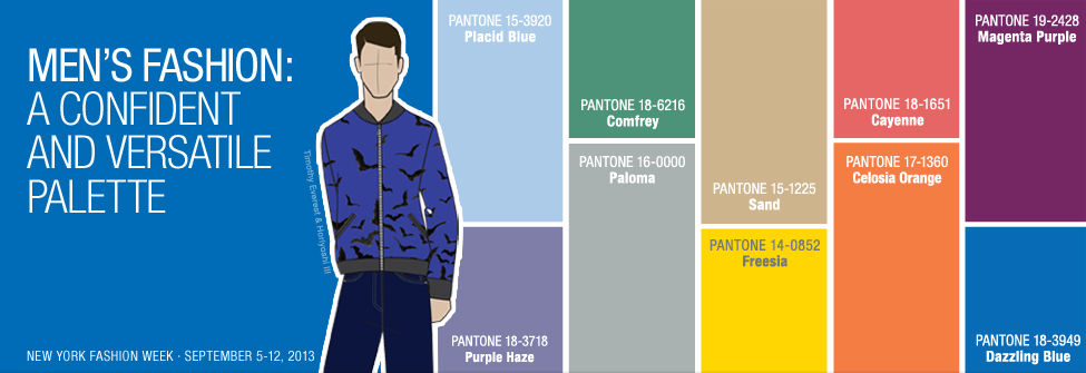
Source: http://www.pantone.com/pages/FCR/default.aspx?season=spring&year=2014&pid=4
Again, start from upper left to right ...
Pantone 15-3920 Placid Blue
Pantone 18-6216 Comfrey
Pantone 15-1225 Sand
Pantone 18-1651 Cayenne
Pantone 19-2428 Magenta Purple
From lower left to right ...
Pantone 18-3718 Purple Haze
Pantone 16-0000 PalomaPantone 14-0852 Freesia
Pantone 17-1360 Celosia Orange
Pantone 18-3949 Dazzling Blue
Compared to the women's, men's shades are just a little darker. It won't strain someone's eyes.
If I will chose a color for my date.. (haha if there is) I would love him to choose the Cayenne on top and Dazzling Blue to pair with. Or better yet, for a cooler side Comfrey shade on top paired with the Dazzling Blue...
Now it's your turn... which one do you think is cooler to wear ??? Whatever you prefer, as long as it won't cross- eyed anyone (just kidding), that would be so cool... and , of course, whichever that you are comfortable to wear with and you carry it presentably, that is definitely 100% cool !!!
Guys, behind this tips we go,t is none other than the Pantone...of course.

LEATRICE EISEMAN Executive Director, Pantone Color Institute®
"This season, consumers are looking for a state of thoughtful, emotional and artistic equilibrium. While this need for stability is reflected in the composition of the palette, the inherent versatility of the individual colors allows for experimentation with new looks and color combinations." (source: http://www.pantone.com/pages/FCR/default.aspx?season=spring&year=2014&pid=3)
For more tips .. please click
http://www.pantone.com/pages/FCR/default.aspx?season=spring&year=2014&pid=3
For more tips .. please click
http://www.pantone.com/pages/FCR/default.aspx?season=spring&year=2014&pid=3


 RSS Feed

